

ART SITES: THE LOST ART OF MAKING A FUN WEBSITE
There used to be websites that seemed actively uninterested in helping you.
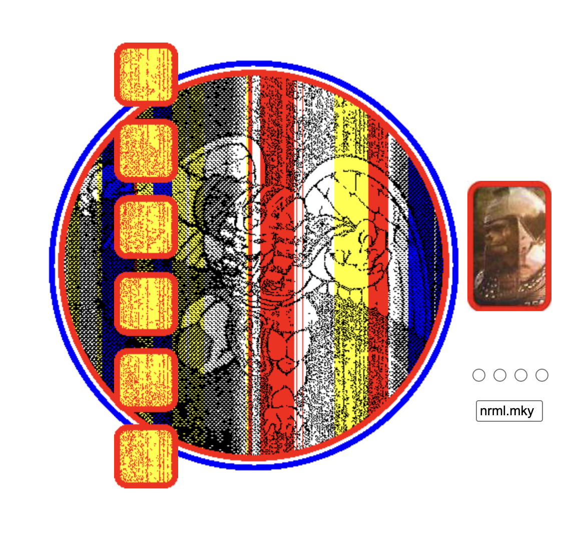
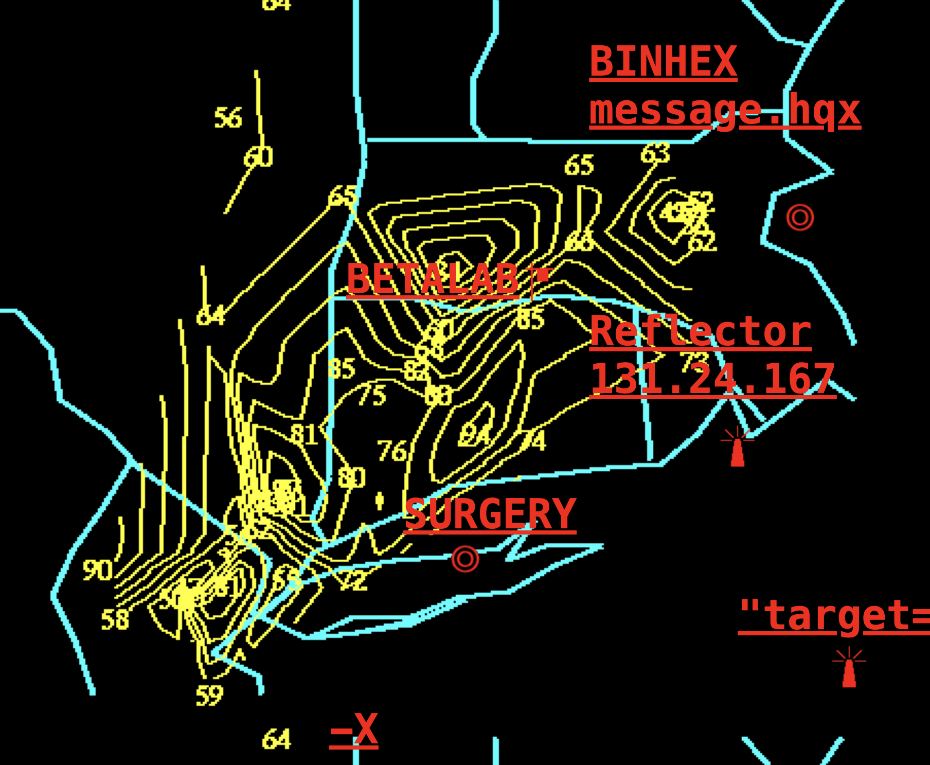
You’d land on a page, click a word, end up somewhere else entirely, hear an audio file start playing for reasons unknown, and realize you had no idea how to get back. There was no menu, no explanation. These were art sites - also called net art - handmade corners of the internet that treated confusion as a feature.
They didn’t sell anything. They didn’t scale. They didn’t load particularly fast. And somehow, they worked.
WHY ART SITES WERE A THING
Early internet culture was built on two powerful forces: boredom and free hosting.
People went online without a plan. You opened your browser the way you opened a fridge: not because you needed something, but because you might find something. Art sites fit perfectly into that mindset. They rewarded aimless clicking and punished efficiency.
Web design was also gloriously unserious. If you knew a little HTML, you could make a site that felt like a dream you half-remembered. No one asked what the user journey was. No one cared if the experience was “intuitive.” The web was still strange, and strangeness felt appropriate.
Art sites didn’t explain themselves because they didn’t have to. Meaning could be fragmented, hidden behind links, or missing entirely. If you didn’t get it, that was fine. You weren’t supposed to.
When the Internet Decided to Be Productive
At some point, the web developed goals.
Design became a science. Every click needed a purpose. Pages were optimized, streamlined, tested, and simplified until nothing unexpected survived. Maze-like navigation was rebranded as “bad UX.” Confusion became something to fix.
Then platforms took over. Instead of building your own weird little world, you posted inside someone else’s perfectly rectangular box. Creativity was still allowed - as long as it fit the template.
The internet stopped being a place to wander and became a place to arrive, do the thing, and leave.
We’re Not Bored Enough Anymore
Art sites relied on boredom the way plants rely on sunlight.
Today, boredom barely gets a chance to form. The moment something is slow, unclear, or mildly demanding, there’s an app happy to rescue you with infinite scroll and algorithmically approved content.
Even making things has become efficient. AI can generate a website in seconds - clean, readable, and correct. But art sites were rarely correct. They were awkward because the person making them was wandering too, clicking around inside their own half-formed ideas.
Art sites asked you to sit with not knowing what was going on. It wastes your time. It doesn’t explain itself. It refuses to load instantly or make sense. It doesn’t care if you stay, but it also doesn’t care if you leave - which is maybe the most offensive thing a website can do now. Modern internet culture gently suggests you should probably move on.
OPTIMIZED, LOOSELY.
I like to think my website is a compromise. It does have a purpose. It’s a shop. You can buy handmade animal sculptures without getting lost forever or accidentally triggering a sound file from 2003. The important things are where they should be.
But if you wander a little, the site wanders back.
There are small detours. Things that don’t announce themselves. Pages that don’t strictly need to exist. Links that lead somewhere slightly overgrown and then stop. Nothing dramatic - just enough to remind you that not every path needs to optimize you toward checkout.
It’s not a full return to the art site era. It’s more of a truce. A working website that still believes in secrets, in taking the long way, in occasionally clicking something just to see what happens.
A happy medium, hopefully. One foot in efficiency, the other gently off the path.
If you’d like to get bored and find your own fun, neocities.org is a living archive of people still making weird, personal, maze-like pages with zero interest in optimization or you can take a look around the useless web.